The Unseen Power of Color: Boosting Brand Recognition by a Remarkable 80%
In the fiercely competitive landscape of modern business, where brands vie for consumer attention at every turn, establishing a distinct and memorable identity is paramount. While many elements contribute to a brand’s persona – from its name and logo to its messaging and customer service – new research sheds light on an often underestimated, yet incredibly potent, factor: color. A signature brand color isn’t just a design choice; it’s a strategic asset capable of dramatically increasing brand recognition, with compelling studies revealing an impressive boost of up to 80%.
This groundbreaking insight underscores the profound psychological and emotional connections consumers forge with brands, often at a subconscious level, driven by the very hues they encounter. For businesses striving to carve out a unique space in the market and cultivate a loyal customer base, understanding and strategically leveraging the power of color is no longer optional – it’s essential.
Unveiling the Impact: New Research on Color Recognition and Brand Identity
Recent investigations into consumer perception have provided concrete evidence of color’s undeniable influence. A comprehensive survey conducted by Reboot, involving 2,648 consumers, explored the direct link between color and brand recall. Participants were presented with various colors and tasked with identifying the brands they represented solely by their hue. The results were striking: an astounding 91% of consumers demonstrated the ability to name at least one brand based on color alone. This statistic highlights a fundamental truth in branding: color acts as a powerful, non-verbal communicator, bypassing text and complex imagery to deliver an immediate, indelible impression.
The survey further detailed specific instances of this phenomenon. A significant 80% of participants could instantly recognize Starbucks, associating it with its iconic green hue without needing to see its mermaid logo or name. Similarly, 67% of respondents accurately identified Ikea simply from a depiction of its distinctive yellow and blue color combination. These examples are not mere anomalies; they are vivid illustrations of how deeply ingrained brand colors become in the collective consciousness, transforming abstract shades into potent symbols of identity, values, and experience.
The Psychological Edge: Why Color Resonates So Deeply with Consumers
The human brain is wired to process visual information rapidly, and color is one of the first attributes we perceive. This inherent neurological predisposition grants color the unique ability to communicate feelings and associations instantaneously. Whether it’s the fiery passion conveyed by red, the calming serenity evoked by green, or the festive energy generated by a vibrant combination of hues, colors speak a universal language that transcends cultural and linguistic barriers. They trigger emotional responses, evoke memories, and even influence purchasing decisions long before any words are read or products examined.
Choosing the right colors for a brand, therefore, extends far beyond aesthetic preference. It’s about meticulously crafting a visual identity that resonates with the target audience, embodies the brand’s core values, and differentiates it from competitors. A well-chosen color palette can instill trust, inspire excitement, convey luxury, or signal affordability, all within a fraction of a second. This immediate emotional connection makes color an indispensable tool in forging a strong, lasting impression and fostering deep brand loyalty.
Beyond Aesthetics: The Psychology of Color in Branding Strategy
To truly harness the power of color, brands must delve into the intricate field of color psychology – the study of how different colors affect human behavior and emotion. Each hue carries a spectrum of connotations, and understanding these associations is critical for strategic brand development. By aligning a brand’s values and desired perception with the psychological impact of specific colors, businesses can communicate their essence more effectively and build stronger connections with their audience.
Decoding Common Color Associations in Branding:
-
Red: The Color of Passion, Energy, and Urgency.
Red is a powerful, attention-grabbing color associated with energy, excitement, love, passion, and urgency. It can stimulate appetite and is often used in food branding (Coca-Cola, McDonald’s) or to denote sales and promotions. Its intensity makes it ideal for brands seeking to evoke a strong, dynamic response. However, over-reliance can also convey aggression or danger, so its application requires careful consideration to maintain a positive, engaging brand image. For instance, Netflix leverages red to signify entertainment, excitement, and a bold, modern approach to media consumption, successfully capturing attention in a crowded digital space.
-
Blue: Trust, Serenity, and Professionalism.
Blue is perhaps the most globally favored color, often linked to trust, stability, reliability, peace, and serenity. Its calming influence makes it a popular choice for corporate businesses, financial institutions, and technology companies (IBM, Facebook, PayPal) aiming to project professionalism, security, and integrity. Different shades of blue can convey varying messages, from light blues suggesting freshness and openness to deep navy blues denoting authority and tradition. This versatility makes blue a cornerstone for brands looking to establish a sense of dependability and a stable presence.
-
Green: Nature, Growth, and Harmony.
Green symbolizes nature, growth, freshness, health, and tranquility. It’s frequently adopted by environmentally conscious brands, those in the health and wellness sector, or businesses seeking to convey a sense of renewal and prosperity. Starbucks’ iconic green, for example, evokes a feeling of calm, natural connection, and a comforting, community-oriented experience. Lighter greens can suggest vitality and energy, while darker greens often communicate prestige and wealth, making it a flexible color for diverse brand narratives.
-
Yellow: Optimism, Warmth, and Joy.
Yellow is an uplifting color associated with happiness, optimism, warmth, and creativity. It can be highly visible and often used to grab attention, stimulate mental activity, or express friendliness and fun. Ikea’s distinctive yellow and blue palette is a masterclass in this, with yellow adding a playful, approachable, and optimistic touch to its brand, making the often-daunting task of furnishing a home feel more accessible and enjoyable. However, an overuse of bright yellow can also be perceived as overwhelming or cheap, so balance is key.
-
Black: Luxury, Sophistication, and Power.
Black is the epitome of elegance, sophistication, power, and luxury. It’s widely embraced by high-end brands, fashion houses, and premium products (Chanel, Dior, high-end electronics) to convey exclusivity, authority, and timeless class. Black commands respect and exudes a sense of prestige, making it a popular choice for brands aiming to position themselves at the upper echelon of their respective industries. Its minimalistic appeal also suggests modernity and sleekness.
-
White: Purity, Simplicity, and Modernity.
White embodies purity, cleanliness, simplicity, and minimalism. It’s often used by brands that want to project a modern, fresh, and uncluttered image (Apple, many healthcare brands). White spaces in design can also create a sense of openness and freedom, allowing other elements to stand out. It’s a versatile backdrop that can enhance the perception of other colors and can communicate transparency and new beginnings, appealing to those who value clarity and straightforwardness.
Crafting Your Brand’s Visual Identity: The Strategic Choice of Color
Selecting a brand’s signature color is a critical step in its overall marketing strategy. It requires a deep understanding of the brand’s core mission, its target demographic, and the competitive landscape. A well-chosen color should not only be visually appealing but also strategically aligned with the brand’s values and the emotional response it aims to elicit from consumers.
Consider the industry context: while a vibrant, playful palette might suit a children’s toy brand, a conservative financial institution would likely opt for colors that convey stability and trust. However, true branding brilliance often lies in finding a unique twist within these industry norms, allowing a brand to stand out while still resonating with consumer expectations. The goal is to create a color identity that is both distinctive and appropriate, capable of communicating the brand’s essence at a glance and fostering instant recognition.
Iconic Hues: Case Studies in Branded Colors
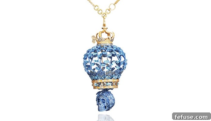
The effectiveness of a signature color is perhaps best illustrated by brands that have mastered its use, elevating a simple hue into a powerful symbol recognized globally. The jewelry industry, with its focus on luxury and timeless appeal, offers some of the most compelling examples.
Tiffany Blue: A Global Icon of Luxury and Exclusivity
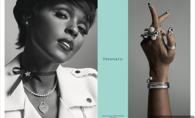
In the realm of luxury, ‘Tiffany Blue’ stands as arguably the most globally recognized branded color. This specific shade of robin’s egg blue, introduced by Charles Lewis Tiffany in 1845 for the company’s “Blue Book” of annual collections, quickly became synonymous with the brand’s exquisite jewelry and unparalleled craftsmanship. So powerful is its association that Tiffany & Co. has taken extensive measures to capitalize on and protect this unique asset. The company has trademarked its iconic Pantone shade, ensuring that every aspect of its online and offline presence, from its signature boxes and bags to its website and advertising campaigns, consistently features this instantly recognizable color.
The consistent and pervasive use of Tiffany Blue has transformed it into more than just a color; it’s a promise of luxury, elegance, and desirability. Consumers don’t just see a blue box; they see a Tiffany box, evoking feelings of anticipation, romance, and prestige. This strategic commitment to a single, distinctive color has provided Tiffany & Co. with an invaluable competitive advantage, making it a masterclass in how a signature color can build an enduring, globally recognized brand identity.
Other Prestigious Examples in the Jewelry and Luxury Sector
Beyond Tiffany, other prominent brands in the luxury sector have also committed to specific colors to reinforce their identities. Swarovski, known for its precision-cut crystals, has embraced a sophisticated royal blue, symbolizing purity, brilliance, and timeless elegance that reflects its product line. Cartier, a titan in the world of high jewelry and watches, adorns itself in a deep, rich red – a color that speaks of passion, power, and timeless luxury, aligning perfectly with its heritage and opulent creations. These brands demonstrate that while uniqueness is valued, consistency in applying the chosen hue across all brand touchpoints is paramount for cementing its recognition.
Beyond Jewelry: Global Brands and Their Signature Shades
The impact of signature colors extends far beyond the luxury sector. Consider Coca-Cola’s vibrant red, a color that instantly evokes energy, excitement, and a classic American feel. FedEx ingeniously uses a combination of purple and orange, with the hidden arrow in its logo becoming even more memorable due to this distinct pairing. Google’s playful, multi-colored logo reflects its diverse offerings and innovative spirit. These examples across various industries underscore a universal truth: a well-chosen and consistently applied color can become the ultimate shorthand for a brand, fostering immediate recognition and deep-seated emotional connections.
Color Trends Across Industries and Global Preferences
While the goal is often to find a unique color, brands also navigate general industry trends and consumer preferences. Research indicates interesting patterns:
- The Luxury Sector’s Affinity for Black: As previously mentioned, black remains the most popular color in the luxury market. Its associations with sophistication, exclusivity, and timelessness perfectly align with the values and aspirations of high-end consumers. Brands like Rolls-Royce, Montblanc, and many haute couture labels leverage black to project an aura of supreme quality and prestige.
- The Prevalence of Red and Blue Globally: On a wider scale, studies reveal that 1 in 3 global brands incorporates red into their logo. This speaks to red’s universal appeal in conveying energy, excitement, and urgency, making brands stand out. Hues of blue are most commonly observed in corporate businesses, financial services, and technology sectors, reinforcing its strong associations with trust, reliability, and professionalism. These two colors dominate the global branding landscape due to their broad psychological impact and widespread cultural acceptance.
- Adapting to Modern Design Principles: Contemporary branding also sees a shift towards simpler palettes and the smart use of white space, especially in the digital realm. Brands are increasingly focusing on how their colors translate across various digital platforms, ensuring legibility, accessibility, and visual harmony, reflecting a move towards cleaner, more user-friendly aesthetics.
Consistency is Key: Reinforcing Your Brand Color Across All Touchpoints
Choosing a signature color is merely the first step. The true power of a brand color is unleashed through relentless consistency in its application. For a color to become deeply intertwined with a brand’s identity and achieve high recognition rates, it must be present and uniform across every single customer touchpoint. This omnichannel approach ensures that consumers encounter the same visual cue, reinforcing the brand message and solidifying its identity in their minds.
This means meticulous attention to detail in:
- Logo Design: The primary representation of the brand.
- Website and Digital Presence: Ensuring the color palette is consistent across web pages, mobile apps, and online advertisements.
- Packaging: The physical manifestation of the brand, crucial for retail recognition (think the Tiffany box).
- Social Media: Consistent use in profiles, posts, and visual content.
- Physical Stores and Office Spaces: Integrating the color into interior design, signage, and uniforms.
- Marketing Materials: Brochures, business cards, and promotional items.
Maintaining brand integrity through strict color guidelines prevents dilution and ensures that the chosen hue always evokes the intended emotions and associations. Deviations can confuse consumers and weaken the brand’s visual identity, making it harder to achieve that crucial 80% recognition boost.
Conclusion: Harnessing the Power of Your Signature Color for Enduring Success
The latest research unequivocally demonstrates that a signature brand color is far more than a decorative element; it is a strategic imperative in the pursuit of brand recognition and market dominance. With the ability to increase recall by an astonishing 80%, color acts as an immediate emotional trigger and a powerful shortcut to brand identification. From the globally recognized Tiffany Blue to the iconic green of Starbucks, history is replete with examples of brands that have leveraged color to forge deep, lasting connections with their audiences.
For any business aiming for enduring success, a thoughtful and strategic approach to color selection and consistent application is non-negotiable. By understanding the psychology behind colors, aligning them with core brand values, and meticulously integrating them across all touchpoints, brands can unlock the profound power of their signature hue. In a visually saturated world, the right color can be the most potent, silent advocate for your brand, speaking volumes without uttering a single word and ensuring that your identity is not just seen, but instantly recognized and remembered.