
The Unrivaled Power of Tiffany Blue: A Masterclass in Brand Identity and Digital Dominance
In the highly competitive world of luxury branding, where capturing and retaining consumer attention is paramount, certain brands distinguish themselves not just by their exceptional products, but by their indelible marks on popular culture. Iconic jewellery brand Tiffany & Co stands as a sterling example, masterfully harnessing the magnetic appeal of its signature color, Tiffany Blue, to cultivate an unparalleled online presence and drive significant digital engagement. While many esteemed brands boast associated hues, none possess a signature color as globally impactful and instantly recognizable as Tiffany & Co’s distinctive robin’s egg blue.
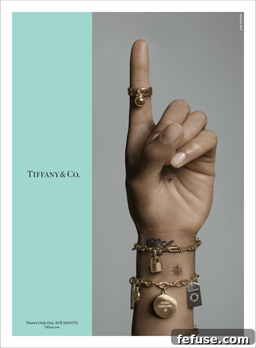
This unique shade, officially trademarked as a color and often referred to by its Pantone custom color match, ‘1837 Blue’ (named after the year Tiffany & Co was founded), transcends mere aesthetics. It has evolved into a potent symbol of luxury, exclusivity, and enduring love. Its ubiquity is such that one marketing expert aptly observed, “Most brands would kill for the sort of instant recognition value of Tiffany & Co.’s robin’s egg blue and that tiny box.” This profound level of recognition is not accidental; it is the culmination of decades of consistent branding and a shrewd understanding of consumer psychology. Consequently, it is no surprise that when it comes to navigating the vast digital landscape and driving traffic online, Tiffany & Co deploys its iconic blue as its primary, most effective weapon in its digital marketing strategy.
More Than Just a Shade: The Deep Roots of Tiffany Blue’s Iconicity
The story of Tiffany Blue is as rich and captivating as the jewels it encases. Its adoption dates back to the mid-19th century, specifically 1845, when Charles Lewis Tiffany chose the distinctive robin’s egg blue for the cover of his annual “Blue Book,” a catalog of the company’s exquisite jewels. This specific shade of blue was popular in 19th-century Victorian bridal fashion, often associated with a sense of sophistication, purity, and trustworthiness. This historical context imbues the color with a timeless elegance and a narrative depth that resonates deeply with consumers even today, reinforcing Tiffany’s heritage branding.
From a psychological standpoint, blue colors generally evoke feelings of calm, reliability, and security. However, Tiffany Blue, with its particular vibrancy and softness, also conjures emotions of joy, excitement, and aspiration. It hints at the preciousness within, turning every interaction with the color into an anticipation of luxury. It’s a color that signifies not just a purchase, but an experience – a moment of unparalleled delight. This emotional resonance is critical in luxury marketing, where the intangible feelings associated with a brand often outweigh the tangible product features. The careful application of color psychology is a cornerstone of this success.
Tiffany Blue as a Cornerstone of Brand Recognition
The immediate and universal recognition afforded by Tiffany Blue is an asset that few brands can claim. In a world saturated with visual stimuli, the ability to stand out and be instantly identifiable is invaluable for brand identity. The mere glimpse of this specific shade, whether on a billboard, a magazine advertisement, or a digital banner, immediately cues the presence of Tiffany & Co. This visual shorthand eliminates the need for overt branding, allowing the color itself to act as a powerful identifier, a testament to effective signature color branding.
This distinctiveness is particularly crucial in the highly competitive luxury branding market. Where other brands might rely on intricate logos or complex campaigns to differentiate themselves, Tiffany & Co leverages the simple yet profound power of its signature color. It cuts through the noise, signaling quality, heritage, and unparalleled craftsmanship. The association is so strong that the color itself has become synonymous with the brand’s core values, projecting an image of enduring elegance and aspirational living. This consistent visual language builds a deep, subconscious connection with consumers, fostering trust and brand loyalty over time.
Strategic Deployment Across Digital Ecosystems
Tiffany & Co’s brilliance lies not just in possessing an iconic color, but in its strategic and ubiquitous deployment across every conceivable digital touchpoint. This ensures that the brand’s identity remains cohesive and impactful, regardless of where or how a consumer encounters it online. This comprehensive approach forms the backbone of their successful digital marketing strategy.
Dominating Social Media Feeds
Social media platforms have become central to modern marketing, and Tiffany & Co has leveraged its signature blue to masterful effect here. The color features regularly and prominently in its social media marketing content, serving diverse roles. It might appear as an elegant background, allowing dazzling jewellery to pop, or as a subtle yet unmistakable blue border framing captivating visuals. This consistent visual language ensures that even when users are passively scrolling through their feeds, not actively searching for luxury items, a splash of Tiffany Blue can instantly halt their thumb, drawing their attention and creating an immediate brand association. This strategy capitalizes on visual recall, turning casual browsing into an opportunity for brand engagement and reinforcing recognition without explicit branding messages. It transforms the often-cluttered social media environment into an extension of the elegant Tiffany world, making every post feel intrinsically premium and aspirational, enhancing customer engagement.
Seamless Integration on the Brand’s Website
The brand’s official website is a meticulously curated digital embodiment of the Tiffany & Co experience. Every corner a consumer navigates, from product pages to checkout flows, prominently features Tiffany Blue. This isn’t merely decorative; it’s a fundamental aspect of the user experience (UX) and user interface (UI) design. The consistent application of the color creates an immersive “Tiffany world” online, guiding the user through a luxurious journey. It serves as a visual anchor, reassuring visitors they are in an authentic Tiffany environment, reinforcing trust and brand legitimacy. Beyond aesthetics, the blue often functions subtly as a call-to-action color or a highlight for important information, drawing the eye naturally and intuitively, thereby enhancing navigation and user engagement, a key component of effective digital marketing strategy.
The Mobile Imperative: Bringing the Blue Box to Every Screen
In an age dominated by smartphones and tablets, optimizing the brand experience for mobile platforms is not just important – it’s critical. Tiffany & Co understands this implicitly. Catherine Lacaze, Tiffany’s VP of North American marketing, articulated this strategy powerfully at an Advertising Week panel: “Blue 1837 is the iconic colour. Wherever [shoppers] go on mobile, we want them to feel the joy they’d feel when they get a blue box. One way or another,” she added, “we’ll follow you and remind you that you’re in the Tiffany world.” This statement perfectly encapsulates the brand’s mobile marketing approach to color branding.
On smaller screens, where visual real estate is limited, the power of a signature color is amplified. Tiffany Blue on mobile platforms is about recreating the tactile and emotional experience of receiving the iconic blue box. It’s about ensuring that the moment of discovery, the thrill of luxury, is palpable even through a small glowing rectangle. This consistency across devices – from large desktop monitors to compact smartphone screens – ensures a seamless and emotionally resonant brand experience, crucial for engaging a generation constantly connected to their mobile devices. The color acts as a reassuring beacon, reminding customers of the brand’s presence and its promise of luxury, whether they are browsing, making a purchase, or simply engaging with content on the go. This focus on mobile is a cornerstone of their digital marketing strategy.
The Psychology of Color in Luxury Branding: Beyond Tiffany Blue
While Tiffany Blue stands as a unique success story, its effectiveness underscores a broader principle: the profound impact of color psychology in luxury branding. Colors are not just visual elements; they are powerful psychological triggers, capable of evoking specific emotions, associations, and perceptions. Luxury brands, in particular, meticulously select their signature colors to align with their brand identity and target audience.
Consider Hermes orange, which radiates warmth, dynamism, and exclusivity, mirroring the brand’s vibrant heritage and audacious designs. Or Ferrari’s iconic Rosso Corsa (racing red), embodying passion, speed, and adrenaline – core tenets of the legendary automotive brand. However, what sets Tiffany Blue apart is its universal adoption as the brand’s primary visual identifier, extending beyond mere packaging or product lines to permeate every aspect of its digital and physical presence. Other brands might use their signature colors prominently, but few have achieved the near-monopoly of recognition that Tiffany has with its blue. This deep integration makes it not just a brand element, but the brand itself in many consumers’ minds, signifying trust, heritage, and the promise of something truly special, exemplifying effective luxury branding.
Sustaining Heritage in the Digital Age: A Timeless Strategy
By deploying its signature color with such consistent intent, Tiffany & Co is able to achieve a crucial strategic objective: establish and maintain its rich heritage and prestige among a new generation of consumers who are constantly immersed in digital environments. In an era where brand loyalty is increasingly fleeting and attention spans are shrinking, a powerful, consistent visual cue like Tiffany Blue provides an anchor to the brand’s storied past. This is paramount for successful heritage branding.
This consistent visual presence acts as a bridge, connecting the brand’s illustrious history with contemporary digital experiences. It reminds consumers of Tiffany’s century-long legacy of craftsmanship, quality, and luxury, even as they interact with the brand through Instagram stories or mobile shopping apps. This strategy is vital for luxury brands seeking to maintain their relevance and desirability across generations. The color doesn’t just evoke a product; it evokes an entire legacy, a feeling of timelessness that resonates with both established patrons and emerging luxury consumers. It fosters an emotional attachment, transforming mere transactions into meaningful experiences tied to a venerable heritage, thereby strengthening brand loyalty.
Lessons for Other Brands: Harnessing the Power of a Signature Hue
The success of Tiffany Blue offers invaluable lessons for businesses across all sectors, illustrating the immense potential of a well-chosen and consistently applied signature color. For brands aspiring to build a similarly strong identity, several key takeaways emerge for their own marketing strategy:
- Uniqueness is Paramount: While trending colors have their place, a signature color must be distinctive enough to stand out in a crowded marketplace. It should ideally be memorable and not easily confused with competitors. This contributes significantly to brand recognition.
- Choose with Purpose: The selection of a brand color should not be arbitrary. It must be rooted in color psychology, aligning with the brand’s core values, desired emotional responses, and target audience’s perceptions. Tiffany Blue evokes trust, luxury, and joy – qualities perfectly aligned with the brand’s offerings.
- Consistency Across All Touchpoints: The power of a signature color is magnified exponentially through consistent application. From physical packaging and storefronts to digital interfaces, social media marketing graphics, and advertising campaigns, every interaction should reinforce the brand’s chosen hue. This seamless integration builds strong mental associations and solidifies brand identity.
- Emotional Connection: A signature color should do more than just identify the brand; it should evoke a feeling. Tiffany Blue triggers feelings of happiness, excitement, and aspiration. Brands should strive to create similar emotional resonance with their chosen color, transforming a visual cue into an emotional touchpoint, fostering greater customer engagement.
- Embrace Digital: In today’s digital-first world, a signature color must translate effectively across all screen sizes and platforms. Brands need to ensure their chosen color maintains its impact and consistency on websites, mobile marketing apps, and social media, optimizing for digital visibility and engagement. This is a critical aspect of any modern digital marketing strategy.
Conclusion
Tiffany & Co’s masterful deployment of its signature Tiffany Blue stands as a testament to the enduring power of effective branding and strategic digital marketing. Far from being a mere aesthetic choice, the robin’s egg blue has become an intrinsic component of the brand’s identity, driving unparalleled recognition, fostering deep emotional connections, and maintaining its illustrious heritage in an ever-evolving digital landscape. Through its omnipresence on social media, its seamless integration across web platforms, and its critical role in mobile engagement, Tiffany Blue ensures that the joy and luxury associated with the brand are palpable at every interaction. This iconic hue serves not just as a visual identifier but as a powerful narrative element, continually reminding consumers that wherever they are, they are indeed in the luxurious and timeless ‘Tiffany world’. It’s a strategy that doesn’t just drive traffic; it builds an empire of unwavering brand loyalty and aspiration, solidifying Tiffany & Co’s position as a leader in luxury branding.