
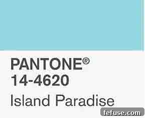
Embrace the Tranquility: Styling Jewelry with Pantone’s Island Paradise
The world of fashion and design is constantly evolving, with color trends playing a pivotal role in shaping aesthetics for each season. Each year, Pantone, the global authority on color, releases its highly anticipated Fashion Color Report, offering a comprehensive overview of the hues that will dominate designer collections. For Spring 2017, one particular shade captured the essence of serenity and escape: Island Paradise. This refreshing aqua hue immediately evokes images of pristine tropical waters, clear skies, and idyllic island getaways, offering a much-needed breath of fresh air amidst the hustle of everyday life.
For jewelers and fashion enthusiasts alike, understanding these color trends is not just about staying current, but about mastering the art of accessorizing. Successfully navigating color-blocking with jewelry allows one to create harmonious, captivating, and incredibly stylish ensembles. Island Paradise, with its cool and calming demeanor, presents unique and exciting opportunities for pairing with various gemstones and metals. It’s a color that speaks to our collective desire for unwinding, for dreaming of a “great escape” to sun-drenched shores. Its cool blue-green shade is both invigorating and soothing, making it a versatile foundation for a wide range of jewelry styles.
To help you perfectly complement this enchanting shade, we’ve gathered five ingenious ways suggested by leading industry peers to color-block with Pantone’s Island Paradise. These expert tips provide inspiration for incorporating this beautiful hue into your wardrobe, ensuring your jewelry choices enhance and celebrate its unique charm, whether you’re aiming for a subtle accent or a vibrant statement.
Understanding the Allure of Island Paradise
Pantone itself eloquently describes Island Paradise as “a refreshing aqua that calls to mind a change of scenery. A cool blue-green shade that speaks to our dream of the great escape, Island Paradise is emblematic of tropical settings and our desire to unwind.” This description perfectly encapsulates the feeling this color evokes. It’s a shade that inspires tranquility, hope, and a sense of wanderlust. Its light, airy quality makes it ideal for spring and summer wardrobes, but its versatility means it can also bring a touch of brightness to cooler seasons. When choosing jewelry to pair with this captivating color, think about how different gemstones and metals can either amplify its tropical feel, provide a striking contrast, or maintain its mellow, harmonious vibe.
1. Embrace the Tropical Spirit: Accentuate with Thematic Jewels
One of the most intuitive and effective ways to complement Island Paradise is by selecting jewelry that echoes its inherent tropical mood. Opting for pieces with designs inspired by the ocean, waves, marine life, or lush island flora can create a cohesive and evocative look. This approach emphasizes the light, airy, and dreamy quality of the color, allowing your accessories to tell a story of paradise found.
As Frédéric Duclos eloquently puts it, “This sterling silver design mimics the crest of a wave—perfect for a day on an island in paradise.” A wave-inspired cuff or pendant in sterling silver doesn’t just accessorize; it transports you. The cool gleam of silver perfectly complements the blue-green tones of Island Paradise, creating a seamless visual narrative. Such pieces are often understated yet powerful, capturing the dynamic beauty of the sea without overwhelming the delicate nature of the color itself. They add an organic touch, a subtle nod to nature’s elegance, making your ensemble feel effortlessly chic and deeply connected to the inspiration behind Island Paradise.
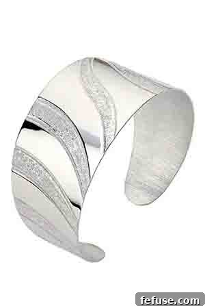
Pacific Wave cuff in silver, $325. This elegant sterling silver cuff captures the fluid motion of a wave, making it an ideal companion for outfits in the serene Island Paradise hue. Its clean lines and polished finish provide a sophisticated touch that enhances the natural beauty of the color.
2. Inject Vibrancy: Pair Island Paradise with Turquoise
For those who desire a more vibrant and energetic look, pairing Island Paradise with turquoise is an exceptional choice. While both hues reside within the blue-green spectrum, turquoise typically possesses a richer, more saturated pigment. This subtle yet significant difference allows turquoise jewelry to “pop” against the softer, lighter backdrop of Island Paradise clothing, creating a dynamic contrast that is both eye-catching and harmonious.
Nina Nguyen highlights this synergy beautifully: “The soft blue turquoise pairs beautifully with Island Paradise. The veins of pyrite running through it and white Australian opals pop against the blue of the Island Paradise turquoise.” This observation underscores the multifaceted appeal of turquoise. Its natural variations, often featuring intricate matrices of other minerals like pyrite, add depth and character. When combined with the ethereal glow of white Australian opals, as in the suggested Medley earrings, the result is a jewel that feels both ancient and utterly modern. The opals introduce a play of light and color that further enriches the pairing, making the entire look feel luxurious and full of life. This combination is perfect for adding an exotic flair, reminiscent of vibrant market scenes or sun-drenched desert landscapes that border the sea.
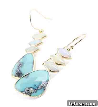
Medley earrings in 14k gold with 14 cts. t.w. turquoise and 6 cts. t.w. opal, $2,798. These exquisite earrings showcase the striking contrast and complementary nature of rich turquoise and shimmering opals, offering a lively enhancement to the serene Island Paradise shade. The warmth of the 14k gold setting adds another layer of sophistication to this vibrant pairing.
3. Create Striking Contrast: Darker Blues and Rose Gold
Sometimes, the most compelling looks are achieved through thoughtful contrast. While Island Paradise is light and airy, introducing a deeper, more saturated blue gemstone can provide an anchor, adding gravitas and sophistication to your ensemble. This approach allows the lighter hue of Island Paradise to truly shine, highlighting its delicate qualities while the darker gem grounds the overall aesthetic.
Gina Ferranti of Gigi Ferranti Jewelry perfectly articulates this strategy: “The Classic Beaded Heart pendant would look great against a garment in Pantone color Island Paradise because they are in the same hue but different saturation levels, allowing the lapis lazuli to stand out. The 14k rose gold accent warms it up a bit like the sun on an island.” Lapis lazuli, with its intense, royal blue and flecks of golden pyrite, offers a majestic depth that beautifully contrasts with the soft aqua. The key here is the variation in saturation; both are blues, but their difference in intensity creates a captivating visual dialogue. Furthermore, the choice of rose gold is crucial. Its warm, rosy undertones provide a lovely counterpoint to the cool blue palette, adding a touch of romance and an unexpected glow, much like a tropical sunset reflecting on the water. This combination is ideal for evening wear or when you want your jewelry to make a refined yet noticeable statement against your Island Paradise attire.
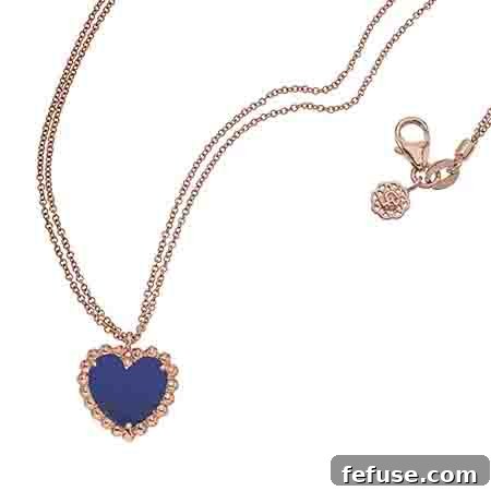
Classic Beaded Heart pendant necklace in 14k rose gold with 1.5 cts. t.w. lapis lazuli, $1,200. This elegant pendant, with its deep lapis lazuli stone set in warm 14k rose gold, offers a stunning contrast to the light Island Paradise, creating a sophisticated and balanced aesthetic. The heart motif adds a timeless charm, making it a versatile piece for various occasions.
4. Maintain Mellowness: Embrace Complementary Cool Tones
For those who appreciate a consistently calm and harmonious aesthetic, pairing Island Paradise with other cool-toned gemstones is a masterful way to maintain its inherent mellowness. This approach creates a sophisticated, monochromatic, or analogous color scheme, resulting in an outfit that feels cohesive, serene, and effortlessly elegant. It’s about building layers of tranquil hues that blend seamlessly rather than starkly contrast.
Tiffany Peay articulates this strategy with precision: “The intensity of the smooth aquamarine complements the watery tones in Island Paradise.” Aquamarine, with its delicate, often pastel blue or blue-green shades, is a natural partner for Island Paradise. Its name, derived from “aqua marina” (water of the sea), perfectly mirrors the inspiration behind the Pantone color. The smooth, polished surface of aquamarine, especially in cabochon cuts, allows its internal glow to shine, echoing the serene depths of tropical waters. When set in white gold or platinum, the cool metal further enhances the icy purity of both the gemstone and the fabric. This pairing is ideal for daytime wear, professional settings, or any occasion where you desire an aura of understated grace and natural sophistication. It’s a testament to the power of subtle variations within a similar color family to create profound visual impact.
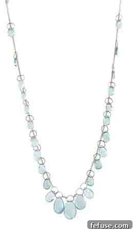
Baby Chain necklace in 14k white gold with 36 cts. t.w. aquamarine, $2,150. This exquisite aquamarine necklace, set in cool 14k white gold, offers a beautifully harmonious complement to Island Paradise, enhancing its watery tones for a refined and tranquil appearance. The substantial carat weight of the aquamarine ensures a noticeable yet elegant presence.
5. Achieve Crisp Cleanliness: Similar Hues with Bright White
For a look that exudes freshness, clarity, and an undeniable crispness, combine a similar-colored gem with Island Paradise clothing, accented by bright white. This combination is particularly evocative of clear blue skies, fluffy white clouds, and the pristine cleanliness of freshly laundered linens. It’s a timeless pairing that feels both classic and utterly contemporary, perfect for welcoming the brighter days of spring and summer.
Belle Étoile brilliantly captures this sentiment: “A delicate shade, very similar to Serenity Blue, Pantone’s Color of the Year for 2016, Island Paradise reflects the blue skies we’ll be seeing in spring 2017! The light and intricate shade will sparkle against any white flowing blouse welcoming spring.” The key here is to choose a gem that closely mirrors Island Paradise, perhaps a lab-created aquamarine or a pale blue topaz. The rhodium-plated, nickel allergy-free silver setting maintains the cool aesthetic, while the addition of white stones or handpainted white Italian enamel introduces that essential bright white element. This creates a luminous effect, making the aqua shades appear even more vibrant and pure. Imagine this ring worn with an Island Paradise dress and a crisp white blazer, or a simple white blouse tucked into Island Paradise trousers. The overall effect is one of effortless sophistication and refreshing elegance, embodying the optimistic spirit of the season.
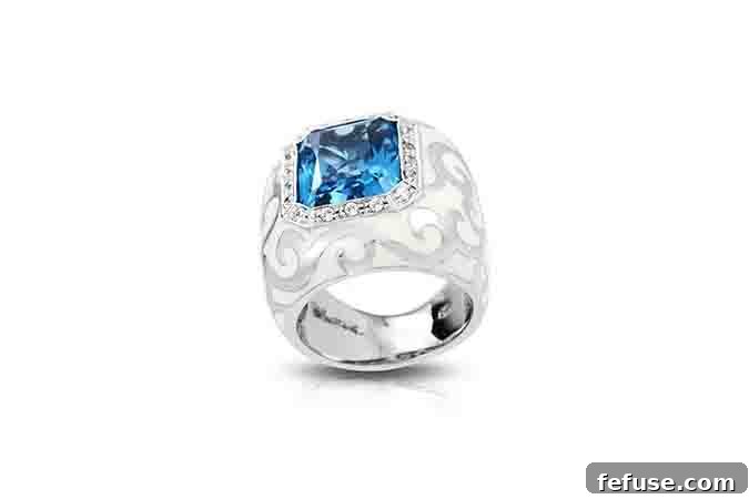
Royale ring in rhodium-plated, nickel allergy-free silver with a lab-created aquamarine, white stones, and handpainted white Italian enamel, $275. This stunning ring, featuring a bright aquamarine and crisp white accents, creates a clean and fresh aesthetic when paired with Island Paradise. Its intricate design and luminous qualities make it a standout piece, perfect for a refined spring look.
The Art of Color Blocking with Jewelry
Color blocking, at its core, is the technique of combining multiple solid blocks of color in an outfit to create a bold and striking look. While often associated with garments, extending this concept to jewelry is where true artistry lies. When working with a distinct color like Island Paradise, your jewelry can either provide a seamless extension of the color, a vibrant burst of complementary energy, or a sophisticated point of contrast. The choices you make in gemstones, metals, and design can drastically alter the overall impact of your ensemble.
Consider the underlying mood of Island Paradise – tranquility, escape, natural beauty. When selecting your jewelry, reflect on whether you want to reinforce this mood, introduce a playful element, or add a touch of unexpected glamour. For instance, pairing with a deep, earthy tone can ground Island Paradise, while a fiery red or orange (though not explored here) would create an adventurous, high-energy contrast. The beauty is in experimentation, but these five expert tips provide a fantastic starting point for mastering the art of accessorizing with this captivating hue.
Conclusion: Dive Into the Tranquil Depths of Island Paradise Style
Pantone’s Island Paradise offers a refreshing and inspiring palette for fashion and jewelry enthusiasts. Its serene blue-green hue is a call to unwind, to dream of idyllic escapes, and to embrace a sense of calm and optimism. By understanding its characteristics and how it interacts with different gemstones and metals, you can unlock a myriad of styling possibilities.
Whether you choose to amplify its tropical spirit with wave-inspired silver, inject a burst of vibrancy with richly veined turquoise, create sophisticated contrast with deep lapis lazuli and warm rose gold, maintain a mellow harmony with cool aquamarines, or achieve a crisp, clean effect with similar-hued gems and bright white accents, Island Paradise proves to be an incredibly versatile foundation for your jewelry wardrobe. These expert insights provide not just styling tips, but an invitation to explore personal expression through the thoughtful combination of color and adornment. Dive into the tranquil depths of Island Paradise, and let your jewelry tell your unique style story.
Remember, the world of jewelry and fashion is ever-evolving, and staying informed about color trends from sources like the Pantone Fashion Color Report is key to keeping your style fresh and relevant. Experiment with these suggestions, mix and match, and discover new ways to make Island Paradise truly your own. Happy styling!