
Mastering Pantone Kale: Expert Jewelry Color Blocking Strategies for Spring 2017 and Beyond
The fashion world constantly evolves, and at its heart lies color. Every season, Pantone, the global authority on color, releases its much-anticipated Fashion Color Report, guiding designers, retailers, and fashion enthusiasts alike. For Spring 2017, one shade that captured significant attention was Kale – a robust, foliage-based green that quickly became a foundational hue in new clothing collections. While the season has passed, the timeless appeal and versatility of Kale (and similar earthy greens) remain highly relevant in contemporary fashion.
For jewelers, understanding these seasonal color dictates is not merely about staying current; it’s about empowering customers. Knowing how to effectively “color block” accessories, particularly fine jewelry, with dominant apparel colors can transform an ordinary outfit into a sophisticated statement. Color blocking, the art of pairing contrasting or complementary colors to create a bold, dynamic look, is a powerful styling technique. When done right, it can highlight both the clothing and the exquisite craftsmanship of jewelry pieces.
This comprehensive guide delves into the enduring allure of Pantone’s Kale and provides five ingenious, expert-backed strategies for color blocking with this grounding green. These insights, originally shared by leading jewelry professionals, offer a masterclass in selecting the perfect gems and metals to elevate any ensemble featuring this earthy shade. Whether you’re a jeweler looking to assist clients or a fashion enthusiast eager to refresh your styling repertoire, these techniques promise to inspire.
The Enduring Appeal of Pantone’s Kale: A Deep Dive into a Grounding Green
Pantone’s description of Kale as “evocative of the great outdoors and a healthy lifestyle” perfectly encapsulates its essence. Unlike its more vivacious Spring 2017 counterpart, Greenery, Kale offers a more subdued yet equally impactful connection to nature. It’s a color that speaks of lush landscapes, fertile soil, and a sense of calm and stability. This rich, natural green shade acts as an ideal backdrop, providing a harmonious and sophisticated foundation against which more vibrant tones can truly pop.
Its inherent earthiness makes Kale incredibly versatile. It transcends seasonal boundaries, feeling as appropriate in a crisp spring outfit as it does in a cozy autumn ensemble. This adaptability means that investments in Kale-colored apparel or accessories will have a longer lifespan in a wardrobe, making the color a smart choice for consumers. For jewelers, this translates to an opportunity to offer timeless pieces that beautifully complement Kale, ensuring their recommendations remain relevant far beyond a single season.
Understanding Kale’s role as a “complementary background” is key to successful color blocking. It doesn’t demand to be the star; instead, it allows other colors to shine, creating balance and depth. This quality makes it particularly adept at working with a wide range of jewelry hues, from cool blues to warm golds, making it a dream for creative styling.
The Art of Color Blocking with Jewelry: Transforming Outfits with Strategic Hues
Color blocking is a dynamic fashion trend that involves pairing two or more solid colors together in an outfit, often creating distinct, eye-catching segments. While typically associated with large blocks of apparel, its principles extend beautifully to accessories, especially jewelry. When strategically chosen, jewelry can introduce a contrasting or harmonious color that completes an outfit, adds an unexpected twist, or subtly enhances the dominant color scheme.
For jewelers, this means being more than just a salesperson; it means becoming a stylist. Guiding customers on how a particular gemstone or metal tone can interact with their Kale-colored dress or sweater adds immense value. It transforms the purchase from a simple acquisition to an informed fashion decision. The goal is to create visual interest and a sense of cohesion, ensuring that the jewelry doesn’t just sit on the wearer but actively contributes to the overall aesthetic.
With Kale’s grounding presence, the possibilities for color blocking are vast. We can introduce brilliance, warmth, depth, or analogous harmony. Let’s explore five expert-approved strategies that demonstrate how to master this art with exquisite jewelry.
Five Expert-Approved Color Blocking Strategies with Pantone Kale
1. Brighten Up Dark Kale Ensembles with Lustrous White Pearls and Pops of Blue Gems
One of the most elegant ways to elevate the deep, earthy tones of Kale is by introducing the serene luminescence of white pearls, beautifully accented with vibrant blue gemstones. This combination plays on both contrast and natural harmony. The bright, iridescent glow of pearls provides a striking counterpoint to Kale’s muted depth, injecting light and sophistication into the ensemble.
Imperial, a renowned name in pearls, beautifully articulates this synergy: “I love the idea of iridescent white pearls with a high luster to bring out the subtlety of Kale. Plus, blue and green go so beautifully together—they complement each other well.” This statement highlights the inherent elegance of pearls and the natural affinity between blue and green. Think of a tranquil forest beside a clear lake – a timeless and calming palette.
A sterling silver bracelet featuring lustrous white baroque freshwater pearls, ranging from 13mm to 20mm, offers a magnificent display of organic beauty. The irregular shapes of baroque pearls add a unique, artisanal touch, ensuring no two pieces are exactly alike. When combined with striking London blue topaz beads, perhaps set within black rhodium-plated sterling silver, the piece gains a captivating contrast. The deep, inky blue of London blue topaz provides that ‘pop’ of color, a vibrant counterpoint to the pearls and a sophisticated companion to Kale. This bracelet, with its blend of classic elegance and contemporary edge, serves as a perfect example of how to lighten and enrich a Kale-colored outfit, offering both brilliance and a touch of serene color.
Bracelet in sterling silver with black rhodium, 13 mm–20 mm white baroque freshwater pearls, and London blue topaz beads, $450
2. Pair Another Shade of Green with Kale’s Earthy Green Color for an Analogous Look
Embracing an analogous color scheme, where colors adjacent on the color wheel are combined, creates a harmonious and sophisticated look. For Kale, this means pairing it with another shade of green, adding depth and nuance without introducing stark contrast. This approach celebrates the beauty of green in its various forms, from deep forest hues to lighter, more translucent tones.
Elizabeth Garvin Fine Jewelry expertly recommends green amethyst for this very purpose: “Green amethyst is a beautifully muted tone, and the rich faceting of these particular stones brings out the full range of its shade—from translucent and cool to dark and dusty—all of which complement the Pantone color Kale.” This insight underscores the importance of texture and cut in revealing the full spectrum of a gemstone’s color. The varying translucency and depth within green amethyst create a multi-dimensional effect that prevents the all-green look from feeling flat.
Consider a pair of “Facets” earrings crafted in oxidized sterling silver and 18K gold. These earrings could feature substantial hand-cut, faceted chunks of green amethyst, totaling around 14.5 carats. The juxtaposition of the dark, oxidized silver and warm 18K gold frames the green amethyst beautifully. The intricate faceting of the stones captures light, revealing subtle shifts in shade from a cool, misty green to a deeper, more profound tone. This analogous pairing with Kale creates an ensemble that is understated yet incredibly rich, exuding an organic elegance that is both modern and timeless. It’s a testament to the power of monochromatic (or near-monochromatic) styling when executed with discerning taste and varied textures.
Facets earrings in oxidized sterling silver and 18K gold with 14.5 cts. t.w. hand-cut, faceted chunks of green amethyst, $1,510
3. Let an Opal with its Mysterious Play of Color Both Lighten Up and Add Depth to a Kale Outfit
For those seeking to infuse an outfit with a touch of magic and ethereal beauty, opals are an unparalleled choice. The mysterious “play of color” within an opal – flashes of rainbow hues dancing across its surface – makes it a captivating companion for the grounded nature of Kale. An opal doesn’t just add a single color; it introduces a spectrum, lightening and adding profound depth simultaneously.
Sophia by Design highlights the opal’s unique ability to complement Kale: “The subtle tones of this opal pendant are the perfect complement to Pantone’s Kale.” This speaks to the opal’s chameleon-like quality, where its internal fire can pick up and reflect surrounding colors, creating a bespoke harmony with the wearer’s attire. The inherent luminosity of an opal acts as a natural spotlight, drawing attention and adding a delicate brilliance against Kale’s deep green.
Imagine a pendant necklace crafted in warm 14K yellow gold, featuring a substantial 2.6-carat crystal opal. The “crystal” designation signifies its transparent or semi-transparent body, allowing for an even more vivid and pronounced play of color. Surrounding this captivating opal could be a delicate halo of 0.14 carats total weight of diamonds, adding a subtle sparkle that enhances the opal’s iridescence without overshadowing it. The warm glow of the yellow gold beautifully contrasts with the cool, earthy green of Kale, while the opal acts as a bridge, its internal fire reflecting hints of green, blue, pink, and yellow. This piece is ideal for adding a touch of sophisticated whimsy and an undeniable focal point to any Kale-colored garment, providing both lightness and an intriguing depth that evolves with every movement.
Pendant necklace in 14k yellow gold with a 2.6 ct. crystal opal and 0.14 ct. t.w. diamonds, $1,710
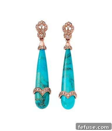
4. Give a Kale Outfit a Burst of Robust Color with Turquoise and Rose Gold
When the goal is to inject a Kale outfit with a vibrant, robust burst of color while maintaining an organic feel, turquoise paired with the modern warmth of rose gold emerges as an exceptional choice. This combination is a celebration of earthy tones meeting serene blues, creating a harmonious and emotionally resonant effect.
Sara Weinstock eloquently captures the essence of this pairing: “These earrings will color-block nicely with Kale because the tones allow for a harmonizing effect. Turquoise represents and is thought to control and heal the emotions, creating emotional balance and stability. The deep earthy color of Kale creates an equal wholeness, allowing these two to perfectly complement one another.” This perspective goes beyond mere aesthetics, tapping into the emotional and symbolic power of colors. Both Kale and turquoise are rooted in nature – Kale in lush foliage, turquoise in the clear skies and waters – fostering a sense of balance and well-being.
Consider a pair of exquisite one-of-a-kind earrings, showcasing a striking combination of 18K rose and white gold. These earrings could feature a significant total weight of turquoise, perhaps around 27.56 carats, cut into intriguing shapes that highlight its natural matrix and captivating robin’s egg blue hue. The turquoise is then beautifully accented with champagne-color diamonds, totaling approximately 0.64 carats. The rose gold provides a warm, contemporary framework that enhances the natural beauty of the turquoise, while the white gold sections add a subtle contrast and brilliance. This pairing with Kale creates an outfit that is both grounding and uplifting, rich in color and symbolic meaning. It’s a statement of confidence and natural beauty, perfectly blending ancient charm with modern elegance, making it an ideal choice for adding a memorable touch to any ensemble.
One-of-a-kind earrings in 18k rose and white gold with 27.56 cts. t.w. turquoise and 0.64 ct. t.w. champagne-color diamonds, $5,080
5. Add Drama to Kale-Color Attire with a Jewel-Tone Gem and Rich Yellow Gold
For those seeking to create a truly dramatic and undeniably regal statement, pairing Kale-colored attire with a rich, deep jewel-tone gemstone set in classic yellow gold is the ultimate strategy. This combination leverages stark contrast to maximum effect, making both the green of Kale and the vibrant gem stand out with unparalleled intensity.
Shelly Purdy champions this powerful pairing, particularly with lapis lazuli: “This undeniably regal 12 mm lapis lazuli set in 18K gold is a striking and eye-catching contrast to the earthiness of Pantone’s Kale. The combination is sophisticated and creates a timeless look.” Lapis lazuli, with its intense, royal blue, immediately introduces a sense of luxury and depth. When set against Kale, the two colors engage in a visual dialogue that is both bold and sophisticated, reminiscent of ancient royalty and precious treasures.
Visualize an exquisite ring crafted in rich 18K yellow gold, featuring a prominent 12mm lapis lazuli cabochon. The smooth, domed surface of the lapis highlights its intense blue color, often flecked with natural pyrite inclusions that shimmer like tiny stars. Adding a touch of understated brilliance, small diamonds, perhaps 0.04 carats total weight, could flank the main stone or be subtly integrated into the band, drawing the eye without detracting from the lapis. The warmth of the yellow gold perfectly complements the deep blue of the lapis, creating a luxurious frame that makes the gem truly pop. When worn with Kale, this ring doesn’t just accessorize; it transforms the entire outfit into a statement of refined drama and timeless elegance. It’s a powerful testament to how strategic color blocking with a single, impactful piece of jewelry can elevate an ensemble to regal heights, perfect for sophisticated evening wear or making a powerful daytime impression.
Ring in 18k gold with lapis and 0.04 ct. t.w. diamonds, $2,200
Beyond the Five: General Tips for Styling with Kale
While the five expert-backed strategies provide excellent starting points, the versatility of Kale extends even further. Here are some additional tips for incorporating this beautiful green into your wardrobe and accessorizing it effectively:
- Consider Textures: Kale’s earthy nature pairs wonderfully with natural textures. Think chunky knits, soft velvets, crisp linens, or even denim. The interplay of fabric texture with the color itself adds another layer of sophistication.
- Metallic Accents: Beyond yellow gold, Kale looks stunning with other metals. Silver and platinum can create a cooler, more contemporary look, especially when paired with white pearls or cool-toned gemstones. Rose gold, as seen above, offers a softer, romantic appeal.
- Complementary Colors: While we focused on blues and other greens, Kale also harmonizes beautifully with muted oranges, soft yellows, and even deeper reds. Consider gemstones like carnelian, citrine, or garnet for unexpected yet compelling combinations.
- Occasion-Specific Styling: For casual wear, a simple Kale sweater can be dressed up with a chunky turquoise necklace. For formal events, a Kale gown can be elevated with emeralds (for an analogous, luxurious look) or diamonds (for pure brilliance).
- Layering: Don’t be afraid to layer different shades of green or combine different jewelry pieces that follow one of these color blocking strategies. A pearl necklace with blue topaz earrings, for example, can create a cohesive and rich aesthetic.
Why Understanding Color Trends Matters for Jewelers and Fashion Enthusiasts
Staying informed about Pantone’s seasonal color reports, even for past seasons like Spring 2017, is invaluable for several reasons. For jewelers, it’s a cornerstone of effective merchandising and customer consultation. Knowledge of trending colors allows them to curate collections that resonate with current fashion sensibilities, design new pieces that are relevant, and most importantly, confidently guide customers towards choices that enhance their personal style and existing wardrobe. It builds trust and establishes the jeweler as a knowledgeable fashion authority.
For fashion enthusiasts, understanding color trends empowers more conscious and creative dressing. It’s about moving beyond simply “matching” and delving into the art of “harmonizing” and “contrasting.” It opens up new possibilities for self-expression and ensures that every accessory chosen contributes meaningfully to the overall look. By embracing colors like Kale and applying thoughtful color blocking techniques, individuals can curate a wardrobe that feels fresh, sophisticated, and deeply personal.
Conclusion: Embrace the Enduring Elegance of Kale
Pantone’s Kale, a truly versatile and grounding green, remains a powerful and elegant choice in the fashion landscape. Its ability to serve as a sophisticated backdrop for an array of vibrant and subtle hues makes it a perennial favorite for thoughtful styling. From the serene luminescence of white pearls and the calming pop of blue topaz to the analogous richness of green amethyst, the mysterious play of opals, the robust burst of turquoise, and the regal drama of lapis lazuli in yellow gold, the possibilities for color blocking with Kale are boundless.
These expert-backed strategies are more than just fashion tips; they are an invitation to experiment, to embrace the art of combining colors, and to discover how the right piece of jewelry can transform an entire outfit. Whether you are a jewelry professional advising clients or an individual seeking to refine your style, mastering the art of color blocking with Kale will undoubtedly add a layer of sophistication and personal expression to your fashion repertoire. So, go forth and confidently adorn your Kale-colored attire with these exquisite jewelry pairings, creating looks that are both timeless and captivating.
This content draws inspiration from insights originally featured on The Style 360 blog, a trusted editorial source for the newest jewelry, trends, fashion, market analysis, trade show insights, designer profiles, and more.