

The fashion world thrives on innovation and inspiration, and at the heart of this dynamic cycle lies the Pantone Spring 2017 Fashion Color Report. This influential guide provides a crucial overview of designers’ preferred palettes, shaping trends from runway to retail. For astute jewelers, understanding these seasonal color choices is not merely an option but a strategic imperative. It empowers them to effectively guide customers in mastering the art of color-blocking accessories, ensuring their jewelry collections remain relevant, appealing, and perfectly aligned with contemporary style. Among the standout hues of Spring 2017, one color emerged as a gentle yet powerful leader: Niagara. This article delves into the essence of Pantone Niagara and presents five expert-backed strategies for jewelers to inspire and assist their customers in incorporating this tranquil shade into their accessory wardrobes.
Understanding Pantone Niagara: The Essence of Spring 2017 Calm
Pantone’s choice of Niagara as a prominent color for Spring 2017 was a significant statement, reflecting a collective desire for comfort, dependability, and ease. As Pantone itself described it:
“Comfortable and dependable, Niagara leads the Pantone Fashion Color Report as the most prevalent color for spring 2017. Niagara is a classic denim-like blue that speaks to our desire for ease and relaxation.”
—Pantone
This deep, yet muted blue evokes the imagery of flowing water and the familiar comfort of well-worn denim. It’s a color that speaks volumes without shouting, offering a sense of calm and stability amidst the hustle and bustle of modern life. Its versatility makes it a cornerstone hue, adaptable to various styles, from casual chic to sophisticated elegance. For jewelers, Niagara presents an exciting opportunity to curate collections that resonate with this understated luxury and timeless appeal. By understanding its inherent qualities—its soothing nature, its classic foundation, and its inherent ability to blend or stand out—jewelers can create compelling narratives around their offerings.
Mastering Jewelry Color Blocking with Pantone Niagara
Color blocking in fashion involves pairing contrasting or complementary colors to create bold, impactful outfits. When applied to jewelry and accessories, it becomes a sophisticated tool to elevate any ensemble. With Pantone Niagara as a focal point, jewelers can help customers make deliberate and stylish choices. Here are five innovative approaches suggested by leading experts in the jewelry industry to perfectly color-block with this quintessential spring shade:
1. Embracing Tranquility: Pairing Niagara with Harmonious, Relaxing Shades
The very essence of Niagara is relaxation, making it an ideal candidate for pairing with other calming hues. This approach creates a seamless, serene aesthetic that feels effortlessly chic. When customers are wearing Niagara-colored clothing, suggest accessories that echo this tranquil mood, using gemstones that provide a soft, harmonious visual flow.
As Elle Jewelry highlights:
“Pantone’s Niagara shade invokes the feeling of relaxation just like this new ring from Elle’s Spring Wave collection.”
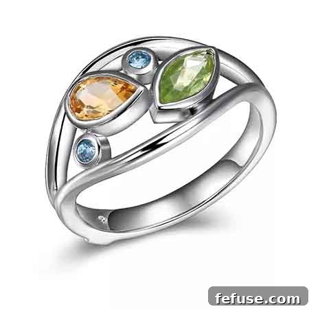
Ring in sterling silver with 1 ct. t.w. blue topaz, peridot, and citrine, $95
This sterling silver ring, adorned with blue topaz, peridot, and citrine, exemplifies the strategy. The gentle blue of the topaz naturally complements Niagara, while the subtle green of peridot and the warm glow of citrine introduce complementary earth tones, enhancing the overall sense of peace and natural beauty. This combination is perfect for customers seeking accessories that are understated yet refined, providing a continuous flow of calm color that accentuates rather than overwhelms.
2. Dynamic Contrast: Niagara Against Cool White Metals and Brilliant Gems
For those looking to create a more striking visual statement, contrasting Niagara with the crispness of white metals and the brilliance of diamonds or pearls offers an unparalleled sophistication. The cool, clean lines of silver, white gold, or platinum provide a stark yet elegant backdrop that makes Niagara pop, transforming a simple outfit into a captivating ensemble.
Lauren Garvey, diamond and gemstone product manager at Stuller, emphasizes this dynamic interplay:
“The bright blue of Pantone’s Niagara set against the stark white of our freshwater pearl and diamond front-back earrings creates an eye-catching contrast. The combination mixes classic with bold and creates dimension that stands out.”
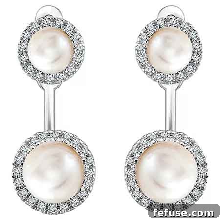
Halo-style studs and earring jackets in 14k white gold with freshwater pearls and 0.2 ct. t.w. diamonds, $1,191
These exquisite halo-style studs and earring jackets in 14k white gold, featuring freshwater pearls and dazzling diamonds, perfectly illustrate the impact of this contrast. The luminous white pearls and sparkling diamonds act as brilliant counterpoints to the depth of Niagara, creating a look that is both timelessly classic and boldly contemporary. This strategy is ideal for customers who wish to add a touch of glamour and sophistication, ensuring their accessories command attention with their refined elegance.
3. Adding Depth: Two-Tone Metals with Niagara for Enhanced Dimension
The versatility of Niagara makes it an excellent partner for the sophisticated trend of two-tone metals. Combining the warmth of gold with the coolness of silver or the romantic blush of rose gold adds intricate dimension and visual interest to any accessory. This approach reflects Niagara’s ‘denim-like’ quality—its ability to be dressed up or down, making it an incredibly adaptable foundation for jewelry choices.
Frédéric Duclos articulates this synergy beautifully:
“Denim-like blue speaks to our desire for relaxation and appreciation of spring, and when mixed with bold gold and silver combinations the effect is classic.”
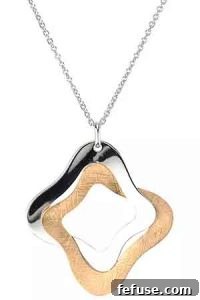
Yvonne necklace in sterling silver and 18k rose gold–plated silver, $200
The Yvonne necklace, crafted from sterling silver and accented with 18k rose gold-plated silver, is a prime example of this elegant strategy. The interplay of the two metals creates a subtle yet captivating visual texture, adding a layer of sophistication that complements the serene depth of Niagara. This combination offers a contemporary twist on classic style, perfect for customers who appreciate nuanced design and desire accessories that effortlessly transition from day to evening. It allows for greater versatility in styling, as the jewelry can match both silver and gold elements within an outfit.
4. Elevating Elegance: Dressing Up Niagara with Rich Yellow Gold Pieces
While Niagara exudes a relaxed charm, it possesses a remarkable capacity for transformation, especially when paired with the opulent glow of rich yellow gold. This combination instantly elevates the denim-like blue, injecting a sense of luxury and warmth that is both inviting and grand. Yellow gold brings out a hidden richness in Niagara, making it suitable for more formal occasions or simply for adding a touch of lavishness to everyday wear.
Beverley K. succinctly captures this perfect alliance:
“Luminous yellow gold pairs perfectly with Pantone’s Niagara.”
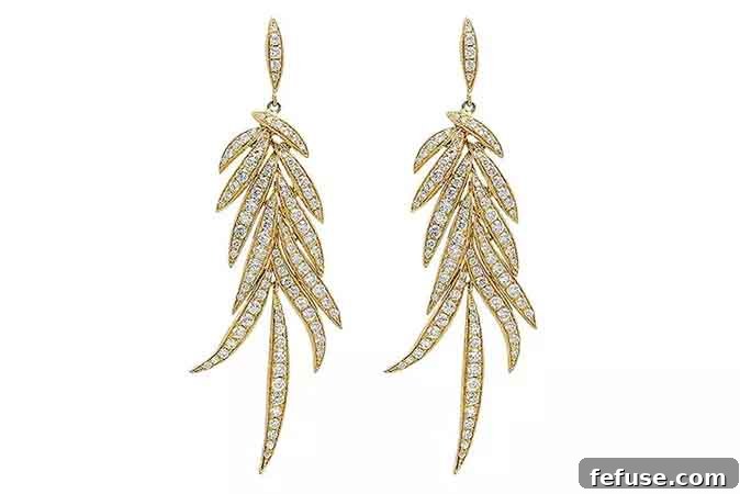
Statement earrings in 18k yellow gold with 2.62 cts. t.w. diamonds, $9,889
These magnificent statement earrings, crafted in 18k yellow gold and adorned with dazzling diamonds, exemplify how to infuse Niagara with undeniable luxury. The deep luster of the yellow gold provides a striking contrast that enriches the blue, creating a vibrant and sophisticated palette. This pairing is ideal for customers seeking to make a bold fashion statement, transforming a serene Niagara outfit into an emblem of refined opulence. It’s a classic combination that exudes confidence and timeless appeal, perfect for special events or simply when one desires to feel exceptionally chic.
5. Harmonious Blues: Analogous Color Effect with Blue Gemstones
For a sophisticated, monochromatic-inspired look, jewelers can recommend an analogous color scheme, pairing Niagara with other beautiful blue gemstones. This strategy creates a seamless flow of color, ranging from the deep tranquility of Niagara to the varied depths and luminosities of other blue stones. The effect is one of elegant harmony and subtle complexity, allowing different shades of blue to dance together beautifully.
Alishan illustrates this harmonious approach:
“These platinum earrings with tourmaline and aquamarine will dance really well with the Pantone Niagara color.”
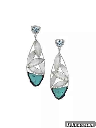
Earrings in platinum with 18.5 cts. t.w. blue tourmaline slices, 2.88 cts. t.w. aquamarine, and 0.76 ct. t.w. diamonds, $14,800
These stunning platinum earrings, featuring expansive blue tourmaline slices, delicate aquamarine, and brilliant diamonds, perfectly capture the essence of this analogous pairing. The different shades of blue in the tourmaline and aquamarine play off the Niagara color with grace and fluidity, creating a layered and rich blue tableau. This approach offers a refined and cohesive look, celebrating the spectrum of blues. It’s an excellent choice for customers who prefer a sophisticated, understated elegance that highlights the beauty of natural gemstones and creates a sense of depth and continuity in their overall presentation.
Conclusion: The Enduring Appeal of Pantone Niagara in Jewelry
Pantone Niagara, with its comforting and dependable nature, proved to be a pivotal color for Spring 2017, and its enduring appeal continues to influence fashion and jewelry choices. By embracing these expert-recommended color-blocking strategies, jewelers can empower their customers to confidently integrate this serene blue into their personal style. Whether by pairing it with relaxing hues, contrasting it with cool white metals, adding dimension with two-tone pieces, elevating it with rich yellow gold, or creating harmonious blue effects, Niagara offers limitless possibilities for sophisticated accessorizing. Strategic accessory choices are crucial for expressing individual style and keeping up with evolving trends. By understanding and leveraging the power of color, jewelers not only sell beautiful pieces but also provide invaluable style guidance, helping customers create looks that are both contemporary and deeply personal.
The Style 360 blog is your editorial source for the newest jewelry, trends, fashion, market analysis, trade show insights, designer profiles, and more.
News Source: JCKOnline.com