
Embracing Optimism: Unveiling Pantone’s Living Coral as the 2019 Color of the Year
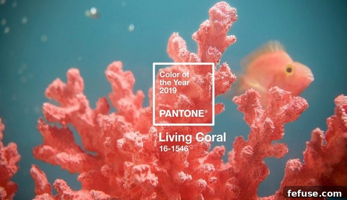
Each year, the Pantone Color Institute captivates the global design and fashion landscape by unveiling its highly anticipated Color of the Year. For 2019, the spotlight shone brightly on PANTONE 16-1546 Living Coral, a hue described by the institute as “animating and life-affirming.” This captivating shade, bursting with golden undertones, was chosen for its inherent ability to “energize and enliven with a softer edge,” offering a warm embrace in an increasingly dynamic and often tumultuous world.
Living Coral is more than just a visually appealing color; it’s a vibrant yet mellow statement that evokes feelings of warmth, nourishment, and heartfelt optimism. In a rapidly changing global environment, this inviting shade emerged as a beacon of positivity, symbolizing our innate need for human connection and joyful interaction. Its choice reflected a deeper understanding of contemporary consumer sentiment, highlighting a collective yearning for genuine experiences and comforting authenticity.
The Essence and Allure of Living Coral
At its core, Living Coral represents a fascinating duality. It possesses an inherent vivacity, reminiscent of the bustling life found beneath the ocean’s surface, yet it carries a gentle, approachable quality. The pronounced golden undertone within Living Coral is crucial to its character, providing a sophisticated warmth that prevents it from being overly bright or jarring. Instead, it offers a nurturing glow, radiating a sense of comfort and subtle luxury. This unique combination allows Living Coral to be both exhilarating and soothing, making it incredibly versatile across various applications.
Pantone’s description of the color as “animating and life-affirming” speaks volumes about its psychological impact. It’s a color that stimulates without overwhelming, fostering a sense of positive energy and vitality. It draws inspiration from the natural world, particularly the breathtaking beauty of coral reefs, which are teeming with diverse life. This natural association imbues Living Coral with an organic sense of wonder and connection to the planet’s most vibrant ecosystems, reminding us of the preciousness of nature and the importance of preserving it.
Symbolism in a Rapidly Evolving World: Connection and Optimism
The selection of Living Coral for 2019 was deeply rooted in prevailing cultural and societal trends. Leatrice Eiseman, executive director of the Pantone Color Institute, articulated this profound connection: “Colour is an equalizing lens through which we experience our natural and digital realities and this is particularly true for Living Coral. With consumers craving human interaction and social connection, the humanising and heartening qualities displayed by the convivial Pantone Living Coral hit a responsive chord.” This insight underscores the color’s role as a bridge between the physical and digital realms, offering a tactile warmth in an increasingly virtual existence.
In an era dominated by screens and social media, there’s an undeniable yearning for authentic human engagement. Living Coral, with its inherently sociable and “convivial” nature, seemed to offer a visual antidote to the potential isolation of digital life. It encourages an open, light-hearted approach to interaction, fostering connection and intimacy. The color’s welcoming disposition instinctively invites engagement, making it a powerful symbol for building community and strengthening personal bonds in a world where digital technology and social media have become an undeniable, pervasive part of everyday living.
Pantone’s Vision: Bridging Natural and Digital Realities
The Pantone Color Institute’s rigorous selection process involves extensive trend analysis, looking across various industries from fashion and film to art, travel, and even socio-economic conditions. Their choice of Living Coral reflects a nuanced understanding of contemporary life, acknowledging the pervasive influence of technology while simultaneously championing our innate need for natural beauty and human touch. Living Coral, in this context, serves as a poignant representation of the fusion of modern life.
The institute eloquently summarized this dual presence: “Representing the fusion of modern life, Living Coral is a nurturing color that appears in our natural surroundings and at the same time, displays a lively presence within social media.” This statement highlights the color’s seamless transition between the organic and the digital. It’s a color we encounter in the breathtaking hues of a sunset or the intricate beauty of marine life, yet it also thrives in the curated aesthetics of Instagram feeds, brand identities, and digital art. It exists comfortably in both spaces, making it uniquely relevant to how we experience the world today.
Living Coral Across Industries: A Design and Lifestyle Impact
The influence of Pantone’s Color of the Year extends far beyond academic discussions, permeating various industries and impacting consumer choices globally. Living Coral, with its compelling narrative and aesthetic versatility, found widespread application:
Fashion and Beauty
In fashion, Living Coral offered a refreshing alternative to more traditional hues, appearing in everything from high couture to everyday apparel. Its warm glow complemented diverse skin tones, making it a popular choice for accessories, swimwear, and resort wear. In beauty, the shade translated beautifully into lipsticks, blushes, and eyeshadows, imparting a natural radiance and a playful pop of color that felt both vibrant and approachable. Designers embraced it for its ability to infuse energy into collections while maintaining an air of sophisticated elegance.
Interior Design and Home Decor
For interior designers, Living Coral provided an exciting opportunity to introduce warmth and personality into living spaces. Whether used as a bold accent wall, in luxurious textiles like cushions and throws, or in statement furniture pieces, it brought a convivial and comforting atmosphere. It paired exceptionally well with natural materials like wood and rattan, as well as with metallic accents, creating interiors that felt both contemporary and inviting. Its life-affirming quality made it ideal for spaces intended for relaxation, socialization, and creative inspiration.
Graphic Design and Branding
The digital presence of Living Coral was undeniable. Brands utilized its optimistic and engaging nature in their visual identities, from logos and websites to advertising campaigns and packaging. Its ability to stand out while remaining harmonious made it an effective tool for capturing attention and conveying a message of approachability, vitality, and modernity. In a crowded digital landscape, Living Coral helped brands create memorable and emotionally resonant experiences for their audiences, fostering a sense of trust and connection.
The Broader Significance of Pantone’s Annual Selection
The Pantone Color of the Year initiative serves as a powerful cultural barometer, reflecting and influencing global trends. By identifying a color that encapsulates the prevailing mood and aspirations of society, Pantone not only helps designers and brands anticipate consumer preferences but also sparks conversations about the deeper meanings and psychological impacts of color in our daily lives. Living Coral, in particular, highlighted a critical juncture in human experience – the tension and synergy between our increasingly digital existence and our enduring need for authentic human connection and natural beauty.
Its selection encouraged a mindful appreciation for the world around us, from the vibrant ecosystems it evokes to the personal interactions it champions. Living Coral acted as a visual reminder to seek joy, foster connection, and maintain an optimistic outlook, even amidst the complexities of modern living. It underscored the profound way color can influence our emotions, our decisions, and our overall perception of the world.
A Lasting Legacy of Warmth and Connection
As the 2019 Color of the Year, Living Coral left an indelible mark, reminding us of the enduring power of color to inspire, uplift, and connect. Its animating and life-affirming essence, combined with its golden, softer edge, offered a much-needed sense of optimism and warmth. In a rapidly evolving world, Living Coral stood out as a beacon of conviviality, encouraging human interaction and fostering a deeper appreciation for both our natural surroundings and our shared digital experiences. It was, and continues to be, a color that resonates with our deepest desires for joy, comfort, and meaningful connection.
NewsSource: jewellerynet.com